Packed and unpacked grids
When resizing a window, the content will either grow with the window or be packed in the top left position.
Grids and stretchable elements
If elements in the window can grow, they will follow the window container and resize accordingly.
Some elements can grow vertically, some can grow horizontally, and some can grow in both directions.
The way resizable form items can grow is controlled by the STRETCH attribute. The window
content is packed horizontally, vertically or in both directions, if none of the elements can grow
in that direction.
The following form item types can grow horizontally:
TABLE/TREEcontainers are horizontally stretchable by designSCROLLGRIDcontainers, with tile-list view renderingIMAGE,TEXTEDIT,WEBCOMPONENTitems, withSTRETCH=BOTHorSTRETCH=X- "Flat" items like
EDIT,BUTTON,COMBOBOXwithSTRETCH=X(see Form item types)
The following form item types can grow vertically:
TABLE/TREEcontainers: by design, whenWANTFIXEDPAGESIZEis not usedSCROLLGRIDcontainers, whenWANTFIXEDPAGESIZE=NOIMAGE,TEXTEDIT,WEBCOMPONENTitems, withSTRETCH=BOTHorSTRETCH=Y
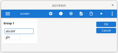
Packed and unpacked grid example
In general, a GRID
container can grow if any object inside the GRID can grow. There is an exception to
this rule. If there is a single GROUP container (defined without the GRIDCHILDRENINPARENT
attribute) inside a GRID and nothing else, the grid can grow even if the objects
inside the grid cannot grow.
This exception allows better rendering of a grouped grid.
LAYOUT
GRID
{
<GROUP g1   >
[f1        ]
[f2   ]
<           >
}
END
END

ATTRIBUTES
GROUP g1: group1, TEXT="Group 1"
        , GRIDCHILDRENINPARENT -- Comment to see the difference
        ;
EDIT f1 = FORMONLY.field1;
EDIT f2 = FORMONLY.field2;
END