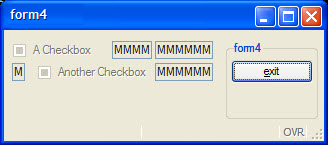
Form item dependencies in grids
Form items interact with each other in terms of width, depending on the front-end widget size.
GRID
{
  [a      ]
  [b      ]
}
END
This .per implies that form items a and b
start at the same position and have the same size, whatever a and
b are.
This rule leads to very different results, especially when a large widget is assigned into a small number of cells.
LAYOUT
GRID
{
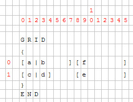
[a|b   ][f     ]
[c|d]   [e     ]
}
END
END

ATTRIBUTES
CHECKBOX a = formonly.a, TEXT="A Checkbox";
EDIT b = formonly.b;
EDIT c = formonly.c;
CHECKBOX d = formonly.d, TEXT="Another Checkbox";
EDIT e = formonly.e;
EDIT f = formonly.f;
END
The grid is computed with regard to the character cells in the form definition:
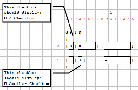
Then the minimum size of each widget and the layout is computed.
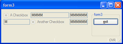
Cells (0,1) and (1,3) contain a checkbox; these checkboxes will enlarge columns 1 and 3.
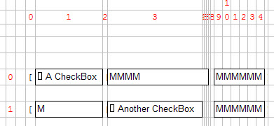
Because the EDIT field "c" is defined to have the same width as
checkbox "a", it will be much larger as expected.
GRID
{
[a        |b  ][f     ]
[c|d          ][e     ]
}
Even if the grid area is wider in the source form file, the real graphical result will be smaller.
