Android™ action bar
On Android devices, apps show an action bar.
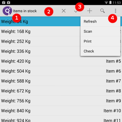
The Android action bar displays in the top of the screen, with several elements having a specific purpose:

- The app icon (1)
- The app icon and the title of the current form display in the upper left corner.
The application title is defined by the
TEXTattribute of the main window displayed by the application.The icon that appears is either the icon set for the app in the packaging, or it is the image specified by the
ui.Interface.setImagemethod. The application icons must be included in the deployment package (.apk) and follow the Android standards (several icon sizes are required). - The view control (2)
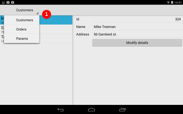
- If your app implements different views controlled by a top-level navigator, this
segment allows users to switch between views. For more details, see Navigator pane. In an application handling multiple views in parallel,
the view control item displays as a text button.
Figure: Android View Control

- Action buttons (3) and Action overflow (4)
- The right-hand side of the action bar shows the actions. The action buttons (3) show
the most important actions of your app. Actions that do not fit in the action bar are moved to the
action overflow, and an overflow icon appears on the right. Tap on the overflow icon to display the
list of remaining action views. If the device has a physical Menu button, the overflow actions are
accessible by pressing the physical Menu button and not from an action overflow icon.
Actions display in the order of the
ON ACTIONstatements of the current dialog. If a toolbar is defined, the actions defined in the toolbar take priority and list prior to other actions, in the order they are defined in the toolbar.If an image is available, it is displayed, otherwise the action text is shown. Depending on the space available (space used by the app icon, screen size, orientation, and so on), the number of actions and the device type, Android displays either the icon or the icon and the text of the action.