Complex grid layout example
Describes how form items align in grid-based front-ends with an example.
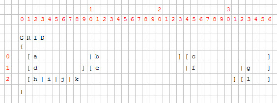
These diagrams show the virtual grid of a complex form, with several field item tags.
Figure: Grid containing several fields

For each form field, the position and the number of cells is computed by the form compiler.
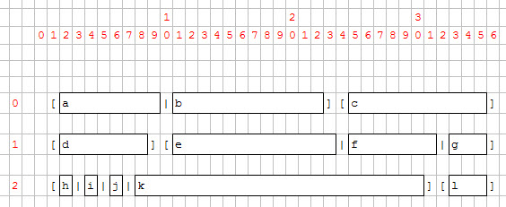
At runtime, the front-end creates the widgets and sets them on the virtual grid.
Figure: Widgets set on grid

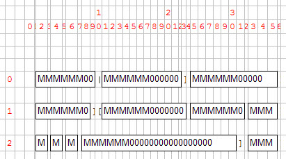
Once widgets are on the grid, their minimum size is computed based on widget size,
SIZEPOLICY, and SAMPLE attributes.
Then the sizes of the grid cells adapt to the size of the widgets.
Figure: Widget size computations

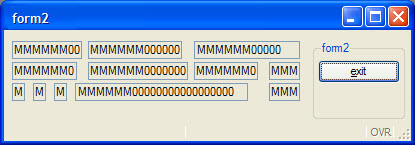
Figure: Widgets in rendered form

In this screenshot, the fields k and c are much bigger than
expected:
- Field
gandlmake columns 33, 34 and 35 bigger than the others, - Field
fextends columns 25 to 31. - As field
chas to fill columns 25 to 35, its size grows; the same for fieldk.
Some fields are proportionally bigger than others because some parameters are variable, while others are fixed.
The width of the widget is the sum of border width, plus the content width (depending on
SIZEPOLICY and the SAMPLE attributes).
Since the default SAMPLE is MMMMMM000..., the graphical width of a field is not
linearly proportional to the width defined in the form file. For example, a field of 1 will be as
wide as 2 borders + 1 'M'. A field of 10 will be as wide as 2 borders + 6 'M' + 4 '0'. This means
that a field of 1 is far from being 10 times smaller than a field of 10.