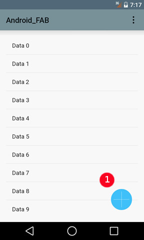
On Android™ devices, apps using material design show a Floating Action Button (FAB).
The Android floating action button displays on the bottom right of the screen, and can be tapped to fire a specific action.

Figure 1. The floating action button (1)
The material design guidelines include the concept of promoted actions, that can be triggered with the floating action button.
Define the list of actions that can be fired from the FAB button with FAB configuration style attributes:
<Style name="Window">
    <StyleAttribute name="materialFABActionList=" value="accept,select,detail" />
</Style>
The order of the actions define which action is triggered when the FAB button is tapped, and several matching actions are active. With the above example, if the "accept" action is disabled, and the "select" and "detail" actions are active, a tap on the FAB button fires the "select" action.
The icon of the FAB button is defined by the IMAGE attribute of the corresponding action. If no IMAGE attribute is defined for the action, a default icon is selected from the built-in icons, according to the name of the action. See Default action views decoration on Android devices for more details about action names to default Android built-in icon mapping.