Split views refer to the ability to access two forms side by side on a mobile device.
Side by side views on mobile apps
Many mobile apps offer a specific form layout, splitting the screen in two in order to show a list of the left side and a detail form on the right side. Such kind of layout can be implemented in Genero with the Split views.
Differences in how split views are handled by the clients
There are differences between the Genero Mobile for iOS (GMI) and Genero Mobile for
Android (GMA) implementations of split views and parallel dialogs, to include:
- When the application displays in a single pane or in two panes.
- How a user switches between the two panes.
There are also differences in how the split view renders between GMA and GMI.

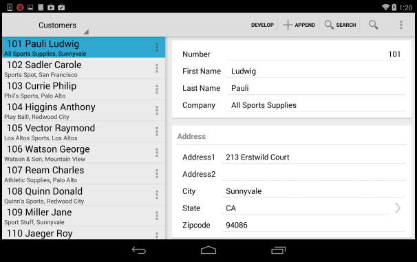
Figure 1. The stores2 demo rendered on an Android device
With Genero Mobile for Android:
- The navigator pane renders as a menu in the left-hand side of the title bar.
- All buttons are merged.
- The title is not displayed when there is a navigator pane. If there is no navigator pane, the title of the current window is displayed.

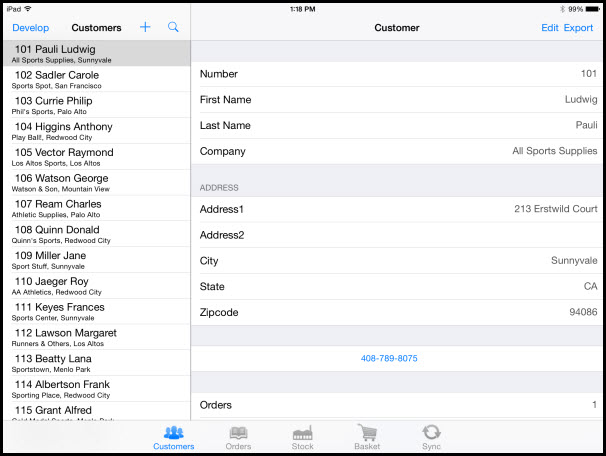
With Genero Mobile for iOS:
- The navigator pane renders along the bottom of the app.
- Each window has its own title and its own buttons.
Figure 2. The stores2 demo rendered on an iOS device