Form items interact with each other in terms of width, according to the front-end widget size.
GRID
{
  [a      ]
  [b      ]
}
END
This .per implies that form items a and b start at the same position and have the same size, whatever a and b are.
This rule could lead to very different results, especially when a large widget is assigned into a small number of cells.
LAYOUT
GRID
{
[a|b   ][f     ]
[c|d]   [e     ]
}
END
END

ATTRIBUTES
CHECKBOX a = formonly.a, TEXT="A Checkbox";
EDIT b = formonly.b;
EDIT c = formonly.c;
CHECKBOX d = formonly.d, TEXT="Another Checkbox";
EDIT e = formonly.e;
EDIT f = formonly.f;
END
The grid will be computed regarding characters cells in the form definition:
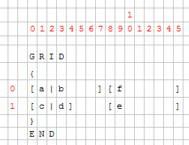
Figure 1. Grid layout
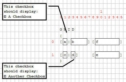
Figure 2. Grid layout with checkboxes
Then the minimum size of each widget and the layout is computed.
Cells (0,1) and (1,3) contain a checkbox; these checkboxes will enlarge columns 1 and 3.
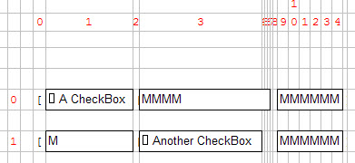
Figure 3. Enlarged columns
Because the EDIT field "c" is defined to have the same width as checkbox "a", it will be much larger as expected.
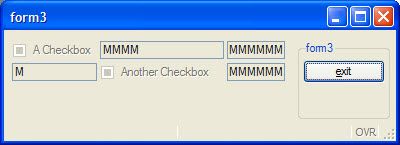
Figure 4. Resulting form
GRID
{
[a        |b  ][f     ]
[c|d          ][e     ]
}
Even if the grid area is wider in the source form file, the real graphical result will be smaller.
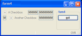
Figure 5. Resulting form