Front-ends follow the next grid layout rules:
- The position of the widgets in the virtual grid is defined by the posX and posY AUI tree attributes.
- The number of virtual grid cells occupied by a widget is defined by the gridWidth and gridHeight AUI tree attributes.
- The real size (i.e. pixels) of a widget is defined by the width and height AUI tree attributes.
- Empty lines and empty columns in the form layout definition take a size of 0 pixels.
- The size of a cell in the virtual grid depends on the real size of the widgets inside the grid.
- Widget's minimum size is computed via its real size and the SAMPLE attribute.
- The preferred size of the widget is computed according to the SIZEPOLICY attribute.
- The final widget size is computed according to the minimum and preferred size, to fill the cells in the grid.
- A small spacing is applied in non-empty cells.
The next screen-shot shows 2 labels and 2 fields placed in a grid.
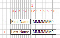
Figure 1. Two labels and two fields placed in a grid: Grid view
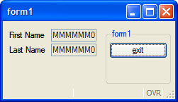
Figure 2. Two labels and two fields placed in a grid: Form view