In a form layout definition, the GRID container is the most important container: it is the leaf of a layout tree and contains all the widgets of the form (fields, buttons, etc). Note that SCROLLGRID containers, as well as group containers define as layout tag inside a grid, without GRIDCHILDRENINPARENT attribute, are similar to GRID containers, regarding layout rules describe in this section.
GRID
{
First Name [fname  ]
Last Name  [lname  ]
}
END
The .per file layout specification can be shown in a character grid.
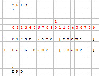
Figure 1. Character grid
With a fixed-font based front end (as a dump terminal), the forms appear within a screen where each cell is identified by x,y coordinates, as in the SCREEN section of the form specification file. There is no particular layout issue, as all characters can be displayed at the same (relative) position as in the source form file.
However, with the graphical front-end, text-based forms must be displayed in a graphical window using fonts with a proportional size. In a propotional font, the field label "Key" will have a different graphical length as the label "Num", even if both labels have the same number of characters.
In the compiled version of the form specification file, all form items get coordinates in a virtual grid (defined by posX and posY attributes), and the number of cells the item occupies in the grid (in the gridWidth and gridHeight attributes):
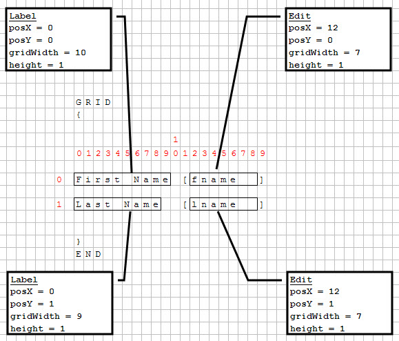
Figure 2. Grid positioning
Note that the "First Name" and "Last Name" texts are identified as whole labels, even if the words "First", "Name" and "Last", "Name" are not joined in the form definition, because the form compiler considers a single blank as a word separator within labels.