HBox Tags allow you to stack form items horizontally without being influenced by elements above or below. In an HBox there is a free mix of Form Fields, labels, and Spacer Items possible.
A typical usage of an HBox Tag is to have zipcode/city form fields side by side with predictable spacing in-between.
The "classic" layout would look like the following form definition:
<G "User Data(version 1.20)"                                      >
 Last Name     [l_name           ]First Name[f_name          ]
 Street        [street                                       ]
 City          [city          ]Zip Code[zip  ]
 Phone(private)[phone           ] At work [                  ]
 Code          [aa]-[ab]-[ac]
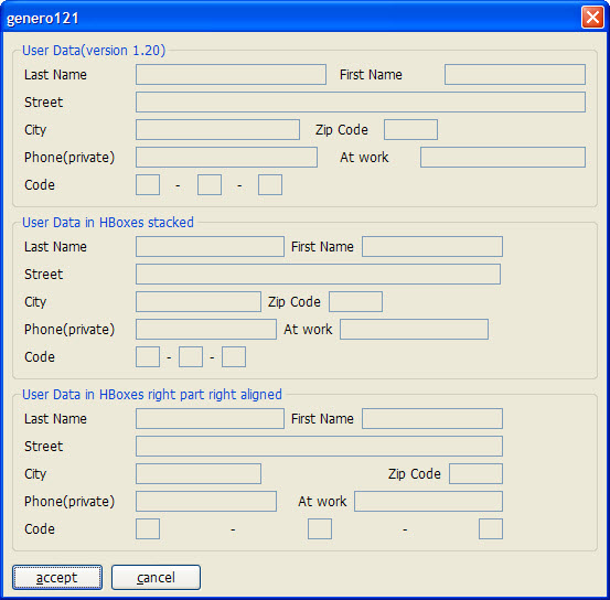
In Figure 1 you will notice that the distance between "l_name" and "First Name" is smaller than between "First Name" and "f_name". How can this be? Two lines under, there is the "zip" field which affects this distance.
If we put HBox Tags around the fields we want to group horizontally together, we get the predictable spacing between "l_name","First Name" and "f_name".
<G "User Data in HBoxes stacked"                                  >
Last Name     [l_nameh         :"First Name":f_nameh         ]
Street        [streeth                                      :]
City          [cityh        :"Zip Code":ziph :               ]
Phone(private)[phoneh          :"At work":phonewh          : ]
Code          [ba:"-":bb:"-":bc:                             ]
Here "l_nameh", "First Name" and "f_nameh" are together in one HBox; the ":" colon acts as a separator between the 3 elements.
The width of an element is calculated from the space between "[" and ":" (width of cityh is 14), or from the space between ":" and ":" (width of "bb" is 2), or from the space between ":" and "]" (width of "f_nameh" is 16). The "zip" field in the version 1.20 example has a width of five and the "ziph" field has also a width of five.
In the second Groupbox in Figure 1 you will notice that the HBox is smaller than the first one, even though it uses two characters more in the screen definition. The reason is that each HBox occupies only ONE cell in the parent grid, and the content in one HBox is independent of the content in another HBox. This relaxes the parent grid; it has to align only the edges of the HBoxes and the labels left of the HBoxes. The two extra characters in the Form file for the second Group come from the fact that the labels need quoting to distinguish them from field definitions. Of course, you could use a Label field if the two extra characters are unwanted (which is done in the third Groupbox).
The third Groupbox shows how the alignment in an HBox can be affected by putting empty elements (: :) inside the HBox Tag:
<G "User Data in HBoxes right part right aligned"                 >
Last Name     [l_nameh2        : :lfirsth2:f_nameh2          ]
Street        [streeth2                                      ]
City          [cityh2          :                  :lzip:ziph2]
Phone(private)[phoneh2        :      :latw:phonewh2          ]
Code          [ca:   "-"        :cb:        "-"           :cc]
Between "l_nameh2" and "lfirsth2" there are two ":" signs with a white space between them. This means: put a Spacer Item between l_nameh2 and lfirsth2, which gets all the additional space if the HBox is bigger than the sum of l_nameh2, lfirsth2 and f_nameh2. The number of spaces, however, has no effect. The spacer item between cityh2 and lzip has the same force as the spacer between l_nameh2 and lfirsth2.
You can treat a spacer item like a spring. The spacer item between cityh2 and lzip presses cityh2 to the left-hand side, and the rest of the fields to the right-hand side. In the "Code" line there is more than one spacer item; they share the additional space among them. (The "Code" HBox sample in the third line is only to show how spacer items work; we always advise using "Code" as in the second Groupbox, or to use a picture)
In general we advise using the approach shown in the second Groupbox: stack the items horizontally by replacing field ends with ":". This is the easy way to remove unwanted horizontal spacing.
Figure 1. HBox tag example screenshot

HBox Tags limitations
HBox Tags don't work for fields of Screen Arrays or Tables; you will get a form compiler error. The reason is that the current AUI structure does not allow this. The front end needs a Matrix element directly in a Grid or a ScrollGrid to perform the necessary positioning calculations for the individual fields.