The COMBOBOX item type defines a line-edit with a drop-down list of values.
Rendering
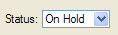
Figure 1. COMBOBOX item type
Syntax
COMBOBOX item-tag = field-name [ , attribute-list ] ;
- item-tag is an identifier that defines the name of the item tag in the layout section.
- field-name identifies the name of the screen record field.
- attribute-list defines the aspect and behavior of the form item.
Attributes
COLOR , COLOR WHERE , COMMENT , DEFAULT , DOWNSHIFT , FONTPITCH , HIDDEN , KEY , INCLUDE , INITIALIZER , ITEMS , JUSTIFY , NOT NULL , NOENTRY , QUERYEDITABLE , REQUIRED , SAMPLE , SCROLL , SIZEPOLICY , STYLE , UPSHIFT , TAG , TABINDEX , VALIDATE LIKE.
Table column only: UNSORTABLE , UNSIZABLE , UNHIDABLE , UNMOVABLE , TITLE.
Usage
The COMBOBOX form item type defines a line-edit with a button on the right side that opens a drop-down list that the end user can browse to select a value from.
The values of the drop-down list are defined by the ITEMS attribute. You can define a simple list of values like ("A","B","C","D", ... ) or you can define a list of key/label combinations like in ((1,"Paris"),(2,"Madrid"),(3,"London")). In the second case, the labels (i.e. the city names) will be displayed according to the key value (the city number) hold by the field.
The INITIALIZER attribute allows you to define an initialization function for the COMBOBOX. This function will be invoked at runtime when the form is loaded, to fill the item list dynamically with database records, for example. It is recommended that you use the TAG attribute, so you can identify in the program the kind of COMBOBOX Form Item to be initialized. The initialization function name if converted to lowercase by fglform.
If neither ITEMS nor INITIALIZER attributes are specified, the form compiler automatically fills the list of items with the values of the INCLUDE attribute, when specified. However, the item list will not automatically be populated with include range values (i.e. values defined using the TO keyword). The INCLUDE attribute can be specified directly in the form or indirectly in the schema files.
During an INPUT, a COMBOBOX field value can only be one of the values specified in the ITEMS attribute. During an CONSTRUCT, aCOMBOBOX field gets an additional 'empty' item (even if the field is NOT NULL), to let the user clear the search condition.
If one of the items is explicitly defined with NULL and the NOT NULL attribute is omitted; In INPUT, selecting the corresponding combobox list item sets the field value to null. In CONSTRUCT, selecting the list item corresponding to null will be equivalent to the = query operator, which will generate a "colname is null" SQL condition.
During a CONSTRUCT, a COMBOBOX is not editable by default: The end-user is forced to set one of the values of the list as defined by the ITEMS attribute, or set the 'empty' item. The QUERYEDITABLE attribute can be used to force the COMBOBOX to be editable during a CONSTRUCT instruction, in order to allow free search criterion input such as "A*". If QUERYEDITABLE is used and the ITEMSare defined with key/label combinations, the text entered by the user will be automatically searched in the list of items. If a label corresponds, the key will be used in the SQL criterion, otherwise the text entered by the user will be used. For example, if the items are defined as ((1,"Paris"),(2,"Madrid"),(3,"London")), and the user enters "Paris" in the field, the item (1,"Paris") will match and will be generate "colname = 1". If the user enters ">2", the text does not match any item so it will be used as is and generate the SQL "colname > 2". Users may enter values like "Par*", but in this case the runtime system will raise an error because this criterion does is not valid for the numeric data type of the field. To avoid end-user confusion, a COMBOBOX defined with key/label combinations should not use the QUERYEDITABLE attribute.
The real widget size of a COMBOBOX is computed according to a specific layout rule described in Widget size within hbox tags.
Some front-ends support different presentation options which can be controlled by a style attribute. You can for example enable the first combobox item to be selected when pressing keys.
COMBOBOX f001 = customer.city,
   ITEMS=((1,"Paris"),
          (2,"Madrid"),
          (3,"London"));
COMBOBOX f002 = customer.sector,
   REQUIRED,
   ITEMS=("SA","SB","SC");
COMBOBOX f003 = customer.state,
   NOT NULL,
   INITIALIZER=myinit;