The CHECKBOX item type defines a boolean checkbox field.
Rendering
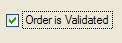
Figure 1. CHECKBOX item type
Syntax
CHECKBOX item-tag = field-name [ , attribute-list ] ;
- item-tag is an identifier that defines the name of the item tag in the layout section.
- field-name identifies the name of the screen record field.
- attribute-list defines the aspect and behavior of the form item.
Attributes
COLOR, COLOR WHERE, COMMENT, DEFAULT, FONTPITCH, HIDDEN, INCLUDE, JUSTIFY, KEY, NOT NULL, NOENTRY, REQUIRED, SAMPLE, SIZEPOLICY, STYLE, TAG, TABINDEX, TEXT, VALIDATE LIKE, VALUECHECKED, VALUEUNCHECKED.
Table column only: UNSORTABLE, UNSIZABLE, UNHIDABLE, UNMOVABLE, TITLE.
Usage
The CHECKBOX item type defines a boolean entry with a box and a text label.
The TEXT attribute defines the label to be displayed near the check box. This attribute can be specified as a localized string.
The box shows a checkmark when the form field contains the value defined in the VALUECHECKED attribute (for example: "Y"), and shows no checkmark if the field value is equal to the value defined by the VALUEUNCHECKED attribute (for example: "N"). If you do not specify the VALUECHECKED or VALUEUNCHECKED attributes, they respectively default to TRUE (integer 1) and FALSE (integer 0).
By default, during an INPUT dialog, a CHECKBOX field can have three states:
- Grayed ( NULL value)
- Checked ( VALUECHECKED value)
- Unchecked ( VALUEUNCHECKED value)
If the field is declared as NOT NULL , the initial state can be grayed if the default value is NULL; once the user has changed the state of theCHECKBOX field, it switches only between checked and unchecked states.
During a CONSTRUCT, a CHECKBOX field always has three possible states (even if the field is NOT NULL), to let the end user clear the search condition:
- Grayed (No search condition)
- Checked (Condition column = VALUECHECKED value)
- Unchecked (Condition column = VALUEUNCHECKED value)
CHECKBOX f001 = customer.active,
   REQUIRED, TEXT="Active",
   VALUECHECKED="Y", VALUEUNCHECKED="N";