The BUTTONEDIT item type defines a line-edit with a push-button that can trigger an action.
Rendering
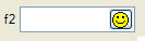
Figure 1. BUTTONEDIT item type
Syntax
BUTTONEDIT item-tag = field-name [ , attribute-list ] ;
- item-tag is an identifier that defines the name of the item tag in the layout section.
- field-name identifies the name of the screen record field.
- attribute-list defines the aspect and behavior of the form item.
Attributes
ACTION, AUTONEXT, CENTURY, COLOR, COLOR WHERE, COMMENT, DEFAULT, DISPLAY LIKE, DOWNSHIFT, FONTPITCH, HIDDEN, FORMAT, IMAGE, INCLUDE, INVISIBLE, JUSTIFY, KEY, NOT NULL, NOTEDITABLE, NOENTRY, PICTURE, PROGRAM, REVERSE, SAMPLE, SCROLL, SIZEPOLICY, STYLE, REQUIRED, TAG, TABINDEX, UPSHIFT, VALIDATE LIKE, VERIFY.
Table column only: UNSORTABLE, UNSIZABLE, UNHIDABLE, UNMOVABLE, TITLE.
Usage
The BUTTONEDIT form item type defines a line edit box with a button on the right side.
This kind of form item is typically used to open a new window that allows the end user to select an item from a list to fill the button-edit field.
The ACTION attribute defines the name of the action to be sent to the program when the user clicks on the button. It can be prefixed with a sub-dialog identifier and/or field name, to define a qualified action view (see action handler binding rules for more details).
The IMAGE attribute defines the picture to be displayed in the button.
By default, the text editor of a BUTTONEDIT allows the user to change the field value. Use the NOTEDITABLE attribute to deny text modification. The field still gets the focus, and the action button remains active, if there is a corresponding action handler in the current dialog.
The real widget size of a BUTTONEDIT is computed according to a specific layout rule described in Widget size within hbox tags.
BUTTONEDIT f001 = customer.state,
   REQUIRED, IMAGE="smiley", ACTION=zoom;