This procedure shows you how to change the progress indicator that displays when the GBC
is waiting for a response from the server.
About this task
This customization involves styling of the loading-bar container by
overriding css selectors in
gbc-project-dir/src/sass/util/loading.scss.
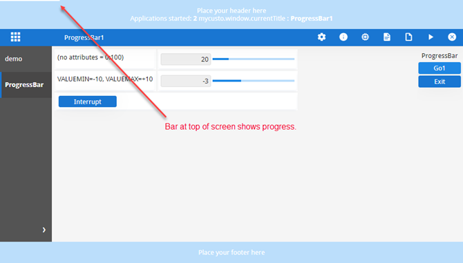
By default, the progress indicator displays as a linear bar at the top of the page,
as in Figure 1.
Figure: Progress indicator displays at the top of the page (default)
This customization changes the progress indicator so it displays as a spinning circle in the
center of the main container.
In your gbc-project-dir/customization/customization-project-dir/sass
directory, create a file called MyProgressIndicator.scss and add the following
code:
This style example defines the animation icon and its behavior:
The style is added for when the .processing selector of the
.gbc_ApplicationWidget has the processing value. This means that the progress
indicator is shown only when the GBC is waiting for a response from the server.
The position of the indicator is fixed to display over other elements
(z-index=9999) in the center of the main container (top: 40%; left:
50%;).
The loading class has settings for the size, border, and color properties of
the icon. Its animation property references the spin rule, and the spin duration
value. The animation continues forever and the linear value specifies an animation with the same
speed from start to finish.
An at-rule, @keyframes spin-loader, specifies how the icon gradually transforms
from the start to the end (0% and 100%) to give the rotation effect.
Open the customization-project-dir/sass/customization.scss
file and add the following import statement:
@import "MyProgressIndicator";
In this example we import the MyProgressIndicator style.
Save your changes and rebuild your customization using gbc build: