Controlling scrollgrid rendering
Scrollgrid rendering can be controlled by the use of presentation styles and scrollgrid attributes.
Scrollgrid resize control
By default scrollgrids are not resizable and the number of fixed rows is defined by the layout
element. The WANTFIXEDPAGESIZE form file attribute controls the vertical resizing of the
list elements. Set this attribute to NO, in order to get a resizable
scrollgrid:
LAYOUT
SCROLLGRID ( WANTFIXEDPAGESIZE=NO )
{
...
Minimum number of scrollgrid lines
INITIALIPAGESIZE form file
attribute:LAYOUT
SCROLLGRID ( WANTFIXEDPAGESIZE=NO, INITIALPAGESIZE=4 )
{
...The INITIALPAGESIZE attribute is mainly useful in modal windows, to define the initial window size.
However, regular windows will be sized from the window container, and the form content will adapt to it.
Paged scrollgrids (tile list)
A scrollgrid can be rendered as a tile list to fit records horizontally and vertically in a page to respond to the container size when stretched or shrunk.
To enable a paged scrollgrid, in your .4st file, define the
customWidget style attribute to the value pagedScrollGrid:
<Style name="ScrollGrid.paged" >
    <StyleAttribute name="customWidget" value="pagedScrollGrid" />
</Style>LAYOUT
SCROLLGRID ( WANTFIXEDPAGESIZE=NO, STYLE="paged" )
{
...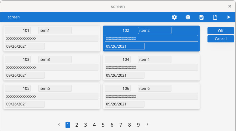
For more details see the customWidget presention style attribute reference.
Controlling element alignment inside a scrollgrid
To control the alignment of the elements inside the scrollgrid, use the
itemsAlignment presentation style:
<Style name="ScrollGrid.centered" >
    <StyleAttribute name="itemsAlignment" value="center" />
</Style>LAYOUT
SCROLLGRID ( WANTFIXEDPAGESIZE=NO, STYLE="centered" )
{
...This attribute applies to default scrollgrid rendering and paged scrollgrid rendering. However,
the possible values of itemsAlignment depend on the type of scrollgrid
rendering.
For more details see the itemsAlignment presention style attribute reference.
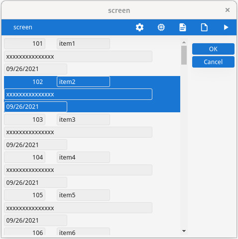
Current row / current cell rendering
In a SCROLLGRID container, the highlighting of the current row (or current cell,
when focus granularity is at the cell level) can be controlled with style attributes:
  <Style name="ScrollGrid">
     <StyleAttribute name="highlightCurrentRow" value="no" />
     <StyleAttribute name="highlightColor" value="#AEFFAE" />
     <StyleAttribute name="highlightTextColor" value="black" />
</Style> 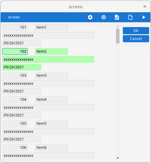
For more details, see Row and cell highlighting in SCROLLGRID.
Current row visibility after dialog execution
When the dialog controlling the scrollgrid has finished, the current row may be deselected,
depending on the KEEP CURRENT ROW
dialog attribute.
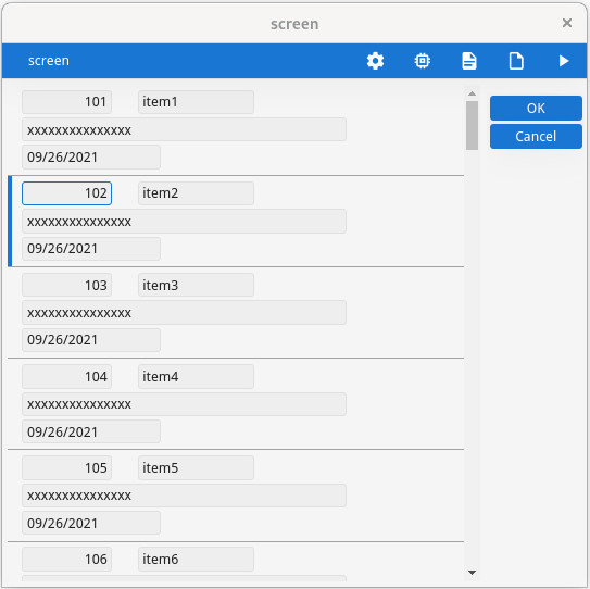
Row aspect control
SCROLLGRID with WANTFIXEDPAGESIZE=NO, use the
rowAspect style attribute to get a Material Design list rendering of the
rows:<Style name="ScrollGrid.list" >
<StyleAttribute name="rowAspect" value="list" />
</Style>When this style attribute is used, the resizable scrollgrid looks like this: